Padding is an essential design tool that improves readability, visual balance, and overall polish in your layouts. The composers let you control padding at both the row and individual content block level.
Quick Reference - Click to Expand
- Default: Set padding for all sides at once
- More options: Control top, bottom, left & right independently
- Rows: Adjust padding for columns via Columns Structure
- Blocks: Use Block options in the sidebar
- Special cases: Buttons & Icons include unique padding controls
Try it like this: Give your hero section more breathing room by adding 40–60px of top and bottom padding to its row, while keeping smaller padding values for content blocks inside it.
Default Padding Features
By default, padding is applied uniformly to all four sides of an element. This is ideal when you need quick spacing around a section or block.
To adjust padding:
- Select the element.
- Use the Padding controls in the sidebar.
For individual side control (top/bottom/left/right), toggle on More options.
Padding in Rows
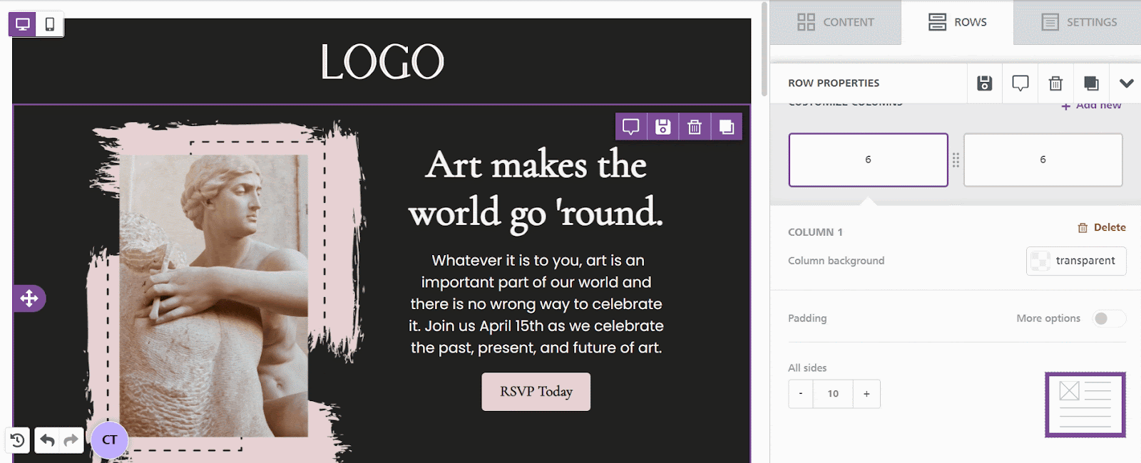
Column-level padding is managed through the row’s Columns Structure panel:
- Scroll to the bottom of the sidebar after selecting a row to access Columns Structure.
- Padding set here affects the entire column inside the row.
Consistency vs. customization:
- For multi-column layouts, consistent padding across columns helps maintain alignment.
- You may set different padding values per column when you want intentional variation.
Padding in Content Blocks
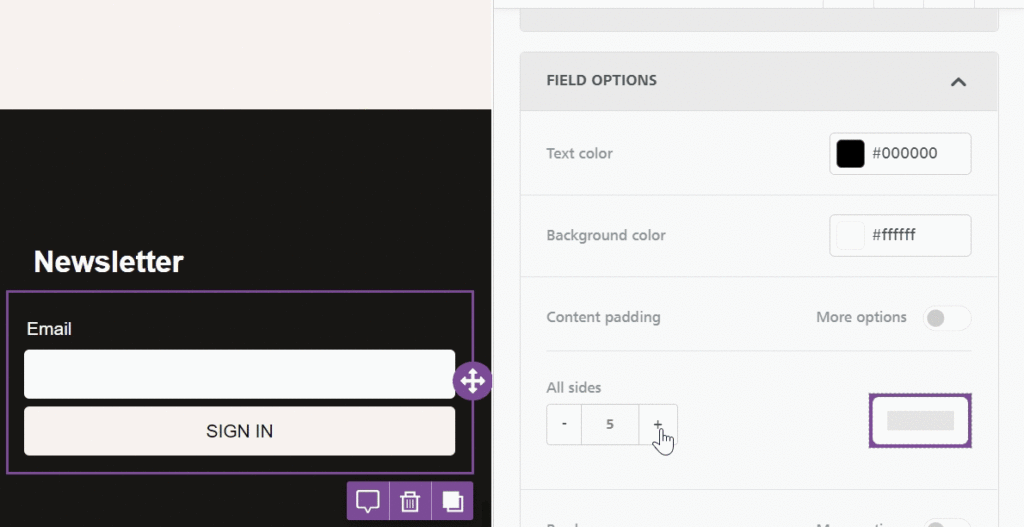
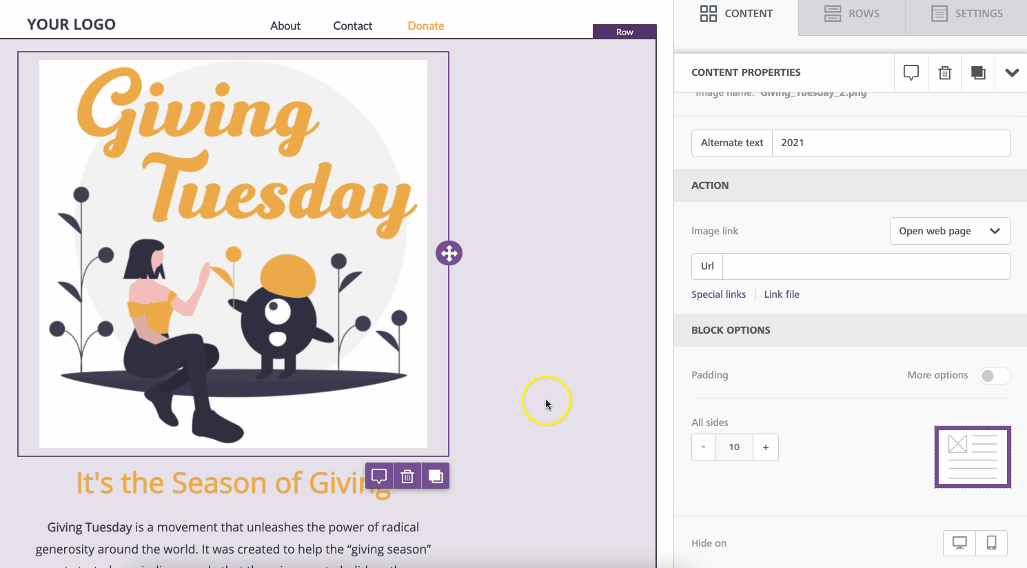
Most content blocks use the sidebar’s Block options for padding:
- Padding applies to the entire block.
- Use this to create separation between text, images, menus, and other elements.
Special Cases: Content Blocks with Unique Padding Options
Buttons
- Include Content padding that affects only the internal space around the button text.
- Helpful for adjusting button shape, height, and text positioning.
Icons
- Include padding controls specifically for the icon images themselves.
- Icons can display both an image and label text, each with its own formatting.