The importance of mobile-friendly design can't be overstated. In Act-On’s Email Composer and Landing Page Composer, most layouts are automatically optimized for mobile by stacking columns vertically. This ensures that even complex, multi-column designs remain readable and visually consistent on smaller screens. However, you can fine-tune how your content behaves on mobile devices using the options described below.
Quick Reference (Advanced Users) - Click to Expand
- Default Behavior: Columns stack vertically in mobile view for readability.
- Do Not Stack on Mobile: Keeps columns side-by-side on mobile.
- Reverse Stack on Mobile: Reverses the order of columns when stacked.
- Mobile Styles: Adjust mobile-only settings like text size, padding, and button width.
- Testing: Always preview on both desktop and mobile before finalizing your design.
Desktop vs. Mobile Preview
The Composer automatically adapts your design for mobile by stacking columns vertically, creating a clean, scrollable layout. This responsive behavior is supported by nearly all modern devices and email clients. However, some older clients that lack CSS support may still display the desktop layout.
Customizable Mobile Behavior
While automatic stacking works well in most cases, there are times when you may want to override this behavior - such as when building navigation menus, side-by-side logos, or image grids. The following Row properties give you control over how your design behaves on mobile devices.
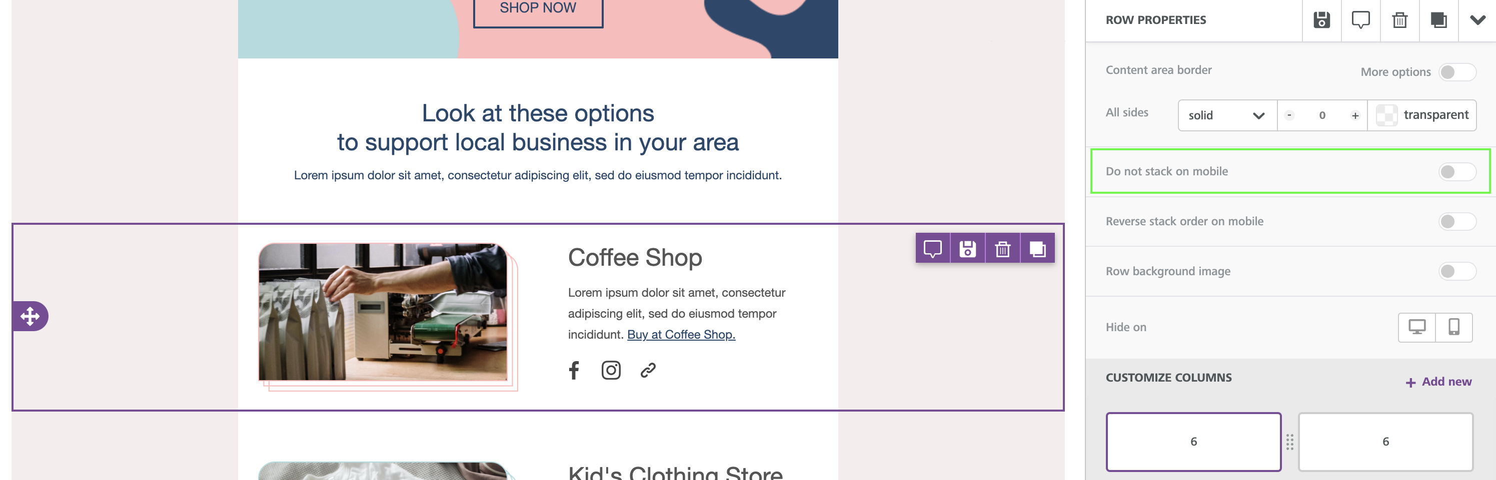
Do Not Stack on Mobile
- This Row-level property prevents columns from stacking vertically on mobile.
- Found in the sidebar under Row Properties, it is toggled off by default.
- Enable this option when you need columns to stay side-by-side, such as small icons or two-line navigation.
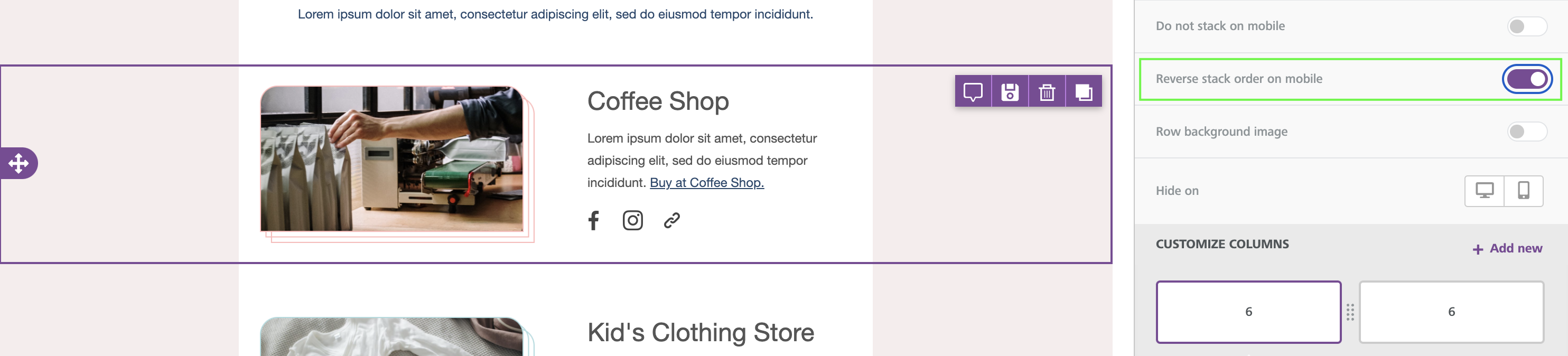
Reverse Stack on Mobile
- This setting reverses the stacking order of columns when viewed on mobile devices.
- Ideal when you want text to appear above an image instead of below it in the mobile layout.
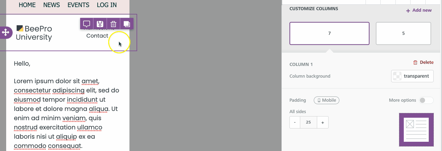
Mobile Styles
The Composer provides mobile-only style settings for granular control of your design. These options appear when editing in Mobile Design Mode and are marked by a mobile-device icon in the sidebar.
- Text size: Adjust font size for readability on smaller screens.
- Padding: Add or reduce space around elements to improve balance.
- Button width: Set full-width buttons for better tap targets.
- Spacer height: Fine-tune vertical spacing between sections.
- Alignment: Control horizontal positioning for mobile layouts.
Special Considerations
Not every design benefits from vertical stacking. Navigation bars, image-based layouts, and multi-column brand banners may require a fixed or reversed structure. Always preview your design across multiple screen sizes to ensure visual consistency and legibility.
Use the visibility toggle (eye icon) in Mobile Design Mode to reveal hidden or device-specific elements and confirm how they render.
Best Practices
- Allow vertical stacking whenever possible - it ensures the best experience for most devices and email clients.
- Use “Do Not Stack on Mobile” sparingly to preserve responsive behavior.
- Keep button sizes large enough for easy tapping (at least 44px height).
- Minimize text in side-by-side layouts - short labels and icons work best.
- Always test your design using both Desktop and Mobile Preview before sending or publishing.