Enhance the readability and visual rhythm of your designs with Letter Spacing and Paragraph Spacing. Available in the Email Composer sidebar for text-based content blocks, these settings help you fine-tune the layout and breathing room of your text.
Small spacing adjustments can improve balance, mimic branded typography, and increase legibility across devices.
Quick Reference (Advanced Users) – Click to Expand
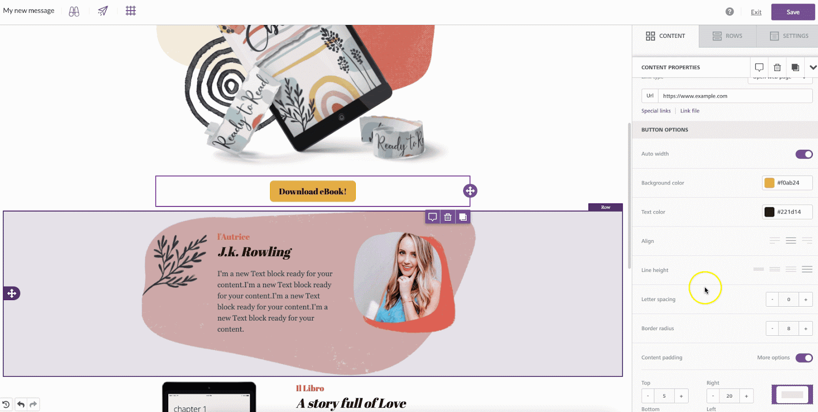
- Letter Spacing: Available for text-based blocks - Paragraph, List, Button, Title, and Icon.
- Paragraph Spacing: Available only for Paragraph blocks.
- Adjustment Range: Letter spacing: -99 to +99px. Paragraph spacing: 0 to 99px.
- Controls: Use the - / + buttons or enter values manually.
- Tip: Use moderate values - excessive spacing can reduce legibility.
Applicability
- Letter Spacing: Applies to Paragraph, List, Button, Title, and Icon content blocks.
- Paragraph Spacing: Applies only to Paragraph blocks.
How It Works
Letter Spacing
Letter Spacing adjusts the horizontal distance between individual characters, allowing you to loosen or tighten your text.
- Default: 0px (no adjustment).
- Control: Use the - and + buttons in the sidebar, or enter a custom value. Negative values reduce spacing; positive values expand it.
- Range: -99px to +99px. Rendering may vary slightly across email clients and browsers.
Paragraph Spacing
Paragraph Spacing adds or removes vertical space between paragraph elements in a Paragraph block. It’s useful for controlling readability and visual flow, especially in multi-paragraph content.
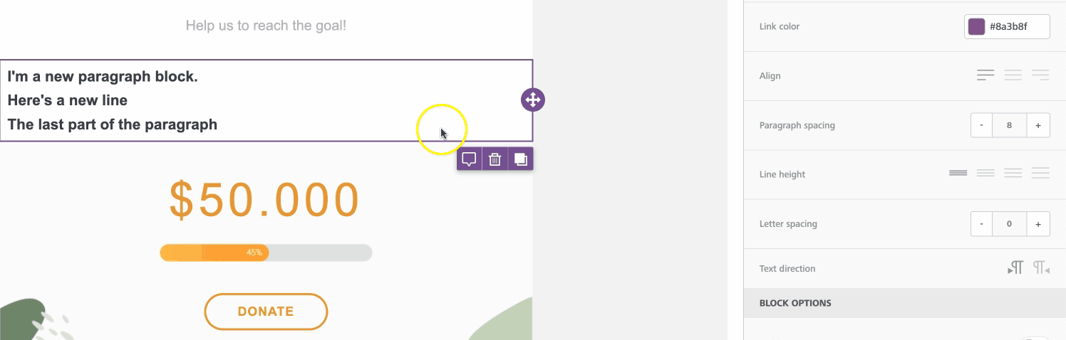
- Default: 14px text size, 16px paragraph spacing.
- Control: Adjust using the - / + buttons or type in a number. Enter 0 for no additional spacing.
- Range: 0–99px. Rendering may vary between devices.
Use Cases
While spacing adjustments should be used sparingly, they can significantly improve readability and visual appeal when applied intentionally:
- Improve readability: Add subtle spacing to all-caps text to make it easier to read.
- Match branding: Recreate the typographic feel of a logo or design theme.
- Optimize for devices: Adjust paragraph spacing to maintain balance on small screens.
Best Practices
- Use small increments - 1–3px is usually enough for letter spacing.
- Maintain contrast: increasing letter spacing can visually lighten text, so check readability.
- Preview designs in both Desktop and Mobile Mode to confirm consistency.
- Avoid negative spacing for long text - it can reduce legibility.