The Divider content block inserts a horizontal line into your design, helping you visually separate sections and improve readability. Dividers are simple but powerful layout tools that give structure and breathing room to your content.
Quick Reference (Advanced Users) - Click to Expand
- Insert: Drag the Divider block into a Row.
- Styles: Solid, dotted, dashed, transparent.
- Controls: Width %, alignment, height, and color.
- Block options: Padding, mobile/desktop visibility, block identifier (Landing Pages).
- Use cases: Segment content, create spacing, or add subtle visual breaks.
Try it like this: Add a Divider between your header and body text, set the width to 40%, align it center, and choose a subtle light gray color to create a clean, modern section break.
Divider Settings
- Transparency option: Toggle Transparent to hide the line completely - perfect for creating customizable spacing without a visible rule.
- Line settings: Choose your preferred style (solid, dotted, dashed), adjust the line height, and set your line color.
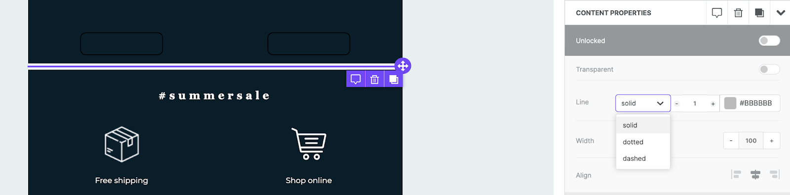
- Width and alignment: Set the divider’s width as a percentage of its container and align it left, center, or right.
- Block options: Configure padding (up to 60px per side) or choose to hide on mobile or desktop.